Mark24
记录灵感、技术、思考
CSS之居中
行内元素
水平居中
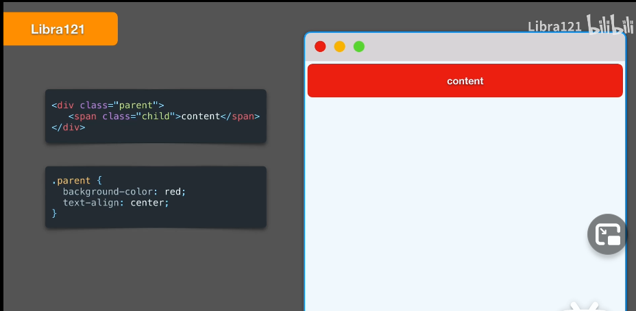
方法1 text-align:center;
<div class="parent">
    <span class="child">content</span>
</div>
.parent {
    background-color:red;
    text-align: center;
}
只需要在父元素上使用 text-align:center 子元素即可居中
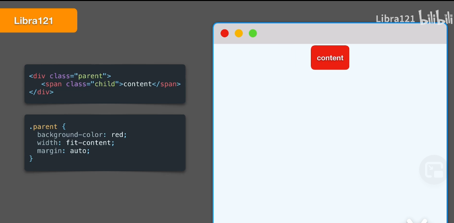
方法2 margin: auto;
<div class="parent">
    <span class="child">content</span>
</div>
.parent {
    background-color:red;
    width: fit-content;
    marigin: auto;
}
fit-content 父元素的宽度会收缩到子元素内容大小。
marigin: auto; 左右auto起到了水平居中。
垂直居中
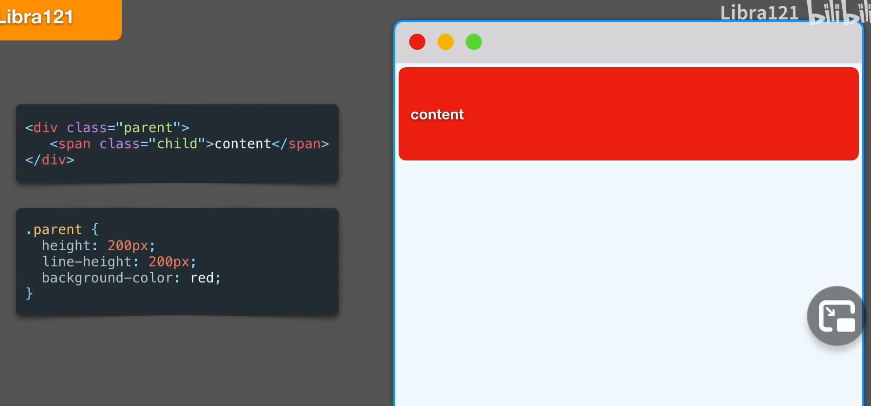
方法1 line-height 只适合单行文本
<div class="parent">
    <span class="child">content</span>
</div>
.parent {
    background-color:red;

    height: 200px; // 需要指定父元素的高度
    line-height: 200px; // 和父元素一样高度,内部的行内元素垂直居中
}
块级元素
居中
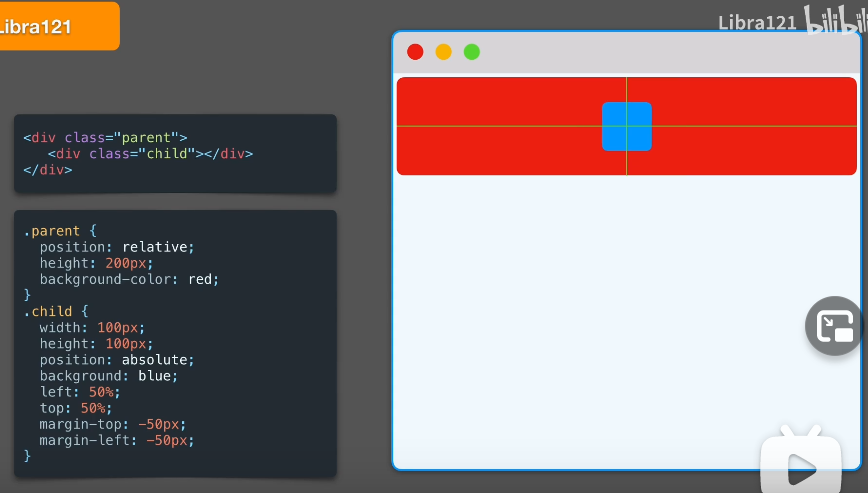
方法1.1 绝对定位+偏移自身尺寸
这个方法的特点是,必须知道自身尺寸,可以实现水平垂直居中。
<div class="parent">
    <span class="child">content</span>
</div>
.parent {
    background-color:red;

    height: 200px;
    position: relative;
}

.child {
    width: 100px;
    height: 100px;
    position: absolute;
    background: blue;

    left: 50%;
    top: 50%;
    margin-top: -50px;
    margin-left: -50px;
}
该方法必须已知自身尺寸的条件下使用。
top,left 便宜50%,元素会被移动到辅助线 以下,然后使用 margin-top,margin-left 为负数,并且为自身尺寸一半
这样被移动到水平、垂直居中。
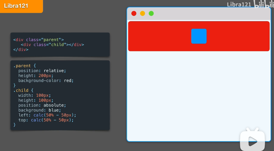
方法1.2 绝对定位+calc偏移距离
<div class="parent">
    <span class="child">content</span>
</div>
.parent {
    background-color:red;

    height: 200px;
    position: relative;
}

.child {
    width: 100px;
    height: 100px;
    position: absolute;
    background: blue;

    left: calc(50% - 50px);
    top: calc(50% - 50px);
}
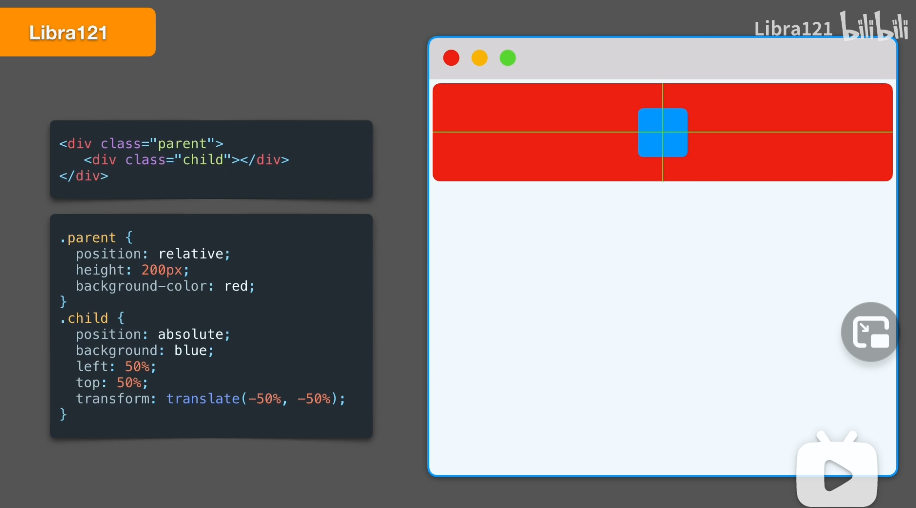
方法2 绝对定位+ transform
这种方法,不需要知道自己的尺寸。使用transform是自己在相对于原始位置发生水平、垂直方向的变形。
缺点是在对transform支持不友好的设备上可能模糊。
<div class="parent">
    <span class="child">content</span>
</div>
.parent {
    background-color:red;

    height: 200px;
    position: relative;
}

.child {
    width: 100px;
    height: 100px;
    position: absolute;
    background: blue;

    left: 50%;
    top: 50%;
    transfrom: translate(-50%,-50%);
}
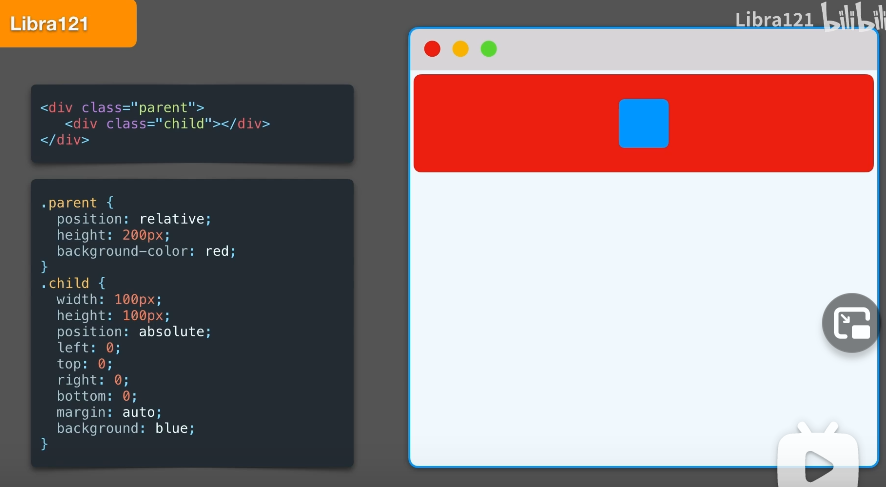
方法3 绝对定位+margin
left: 0;
right: 0;
top: 0;
bottom: 0;
子元素会填充父元素的所有空间,然后margin:auto就会使得元素居中。
<div class="parent">
    <span class="child">content</span>
</div>
.parent {
    background-color:red;

    height: 200px;
    position: relative;
}

.child {
    width: 100px;
    height: 100px;
    background: blue;

    position: absolute;
    left: 0;
    right: 0;
    top: 0;
    bottom: 0;
    margin: auto;
}
方法4 padding
简单说就是 子元素填充整个父元素空间。父元素 padding固定数值。
视觉上子元素是居中。
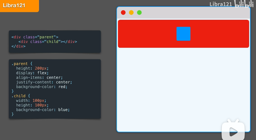
方法5 flex
这个方法是最通用方法。 只需要设备支持flex。
父元素最关键的三行代码
    display: flex;
    align-items: center;
    justify-content: center;
<div class="parent">
    <span class="child">content</span>
</div>
.parent {
    background-color:red;
    height: 200px;

    display: flex;
    align-items: center;
    justify-content: center;
}

.child {
    width: 100px;
    height: 100px;
}
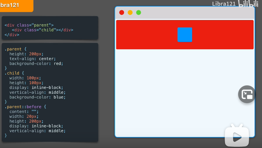
方法6 伪元素
父元素 ` text-align: center; 子元素 display: inline-block;`可以实现水平居中。
<div class="parent">
    <span class="child">content</span>
</div>
.parent {
    background-color:red;
    height: 200px;

    text-align: center; // 使得行内子元素居中
}

.child {
    width: 100px;
    height: 100px;

    display: inline-block; // 让自己显示为行内元素

    vertical-align: middle;
}

.parent::before {
    background-color: yellow;
    content: "";
    width: 20px;
    height: 200px;
    display: inline-block; // 必须设置成块元素,因为伪元素默认是行内元素宽高不工作

    vertical-align: middle;

}
伪元素和子元素全部变成 inline-block, 通过vertical-align垂直居中。
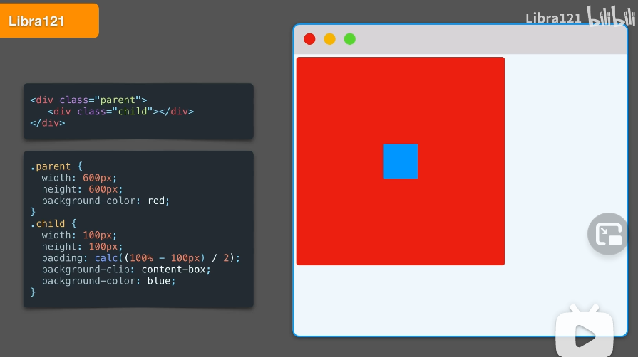
方法7 calc计算
适用于宽高已知,可以计算的形况。
<div class="parent">
    <span class="child">content</span>
</div>
.parent {
    background-color:red;


    width: 600px;
    height: 600px;
}

.child {
    background-color: blue;
    width: 100px;
    height: 100px;

    padding: calc((100% - 100px) / 2);
    background-clip: content-box;
}
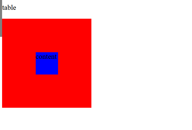
方法8 table-cell
<div class="parent">
    <span class="child">content</span>
</div>
.parent {
    background-color:red;


    width: 600px;
    height: 600px;

    display: table-cell;// 关键
    vertical-align: middle;// 关键
}

.child {
    background-color: blue;
    width: 100px;
    height: 100px;

    margin:0 auto; // 关键
}
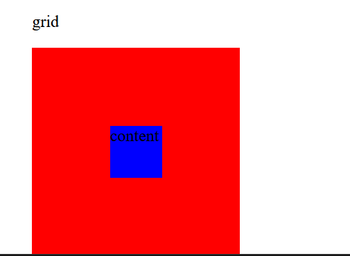
方法9 grid 网格布局
<div class="parent">
    <span class="child">content</span>
</div>
.parent {
    background-color:red;
    width: 600px;
    height: 600px;

    display: grid;// 关键
    justify-content: center;// 关键
    align-items: center;// 关键
}

.child {
    background-color: blue;
    width: 100px;
    height: 100px;
}